Announcing: Skeleton 🩻, the culminating project of my PhD!
My final research project looked at the barriers that sighted practitioners face when authoring non-visual data experiences. We co-designed, built tooling, built a UI prototype, and ran a study.
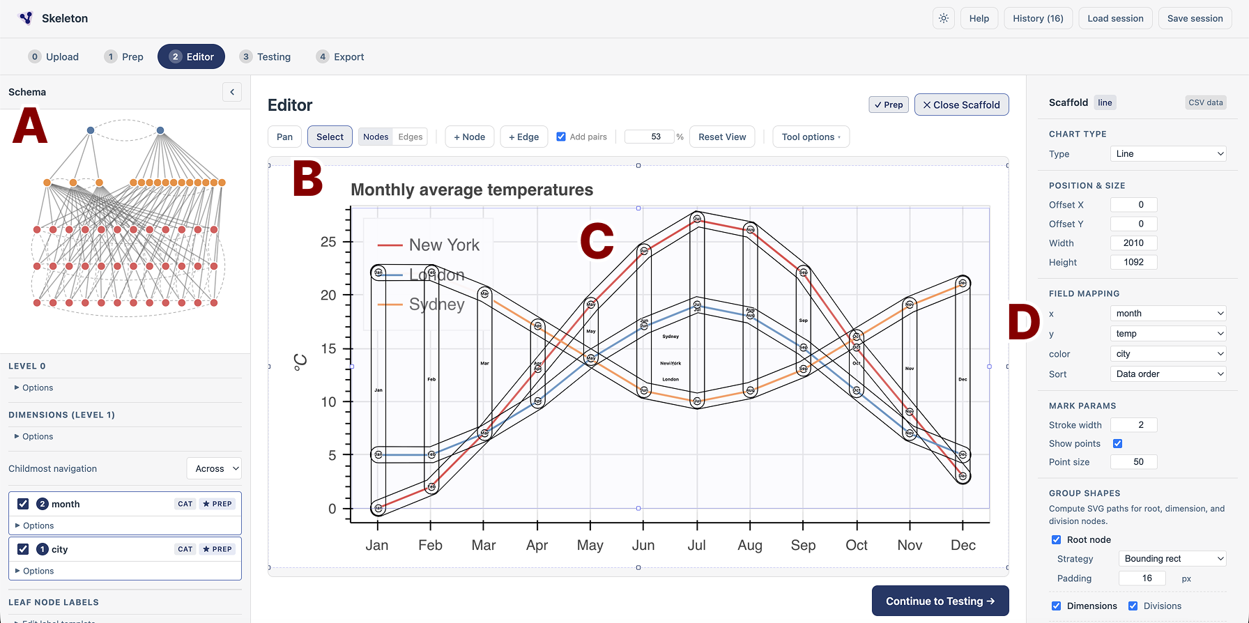
The final project of my PhD, titled “Skeleton: Visual Authoring of Non-visual Data Experiences” has now been fully accepted at IEEE VIS 2026. Woohoo! (You can check out the pre-print of the paper at this link.) Depending on who you are, my reader, this announcement means different things. To my fellow academics: this is great news! VIS is the premier venue for visualization research. This will be a fantastic opportunity for me to share my work and findings with other researchers. I look forward to future chats with you all!
But for my fellow practitioners, why does this matter? Well, our paper outlines this a bit more (and if you’ve never read an academic paper, give it a shot!), but we oriented our work as action research. That means that our technical projects (the things we built) were grounded in work with practitioners. Our work was relevant to them, so I hope to you my reader, it will be relevant too.
Yet before I jump into a bulleted list of TL;DR takeaways, I desperately hope that whoever you are, an academic, practitioner, or someone random, that you will stick around at least for my short pre-requisite introduction to this topic first.
But here is the bulleted list of takeaways:
- Sighted people face barriers when authoring non-visual data experiences
- We built a tool to visualize the data structure used to make charts and graphs navigable
- We built a tool that mirrors the grammar of graphics, but focuses on non-visual navigation dimensions in charts and graphs
- We then built a visual user interface that makes it so that a user can directly manipulate non-visual data experiences they are authoring as well as test their experiences
- We also had some fun with heuristic-based (non-ML) computer vision and some other neat tricks to make scaffolding navigation experiences as fast and easy as possible
- Lastly, our study revealed quite a lot! But our most important finding was that sighted practitioners treat non-visual experiences as equal to visuals once they can see and manipulate them. They iterate independently and substantially once they can see a design element, they treat non-visual experiences as a complex and serious space of design, and they even iterated on their visual design choices once they understood how their visuals might influence the non-visual experiences people will have of their charts!
A brief introduction: What is wrong? What matters? Why accessibility and visualization?
I finally articulate and unpack why I do this work, in length, in my thesis (which is now out in the world, officially). If you want a deeper dive, check it out (or my smaller baby thesis sub-docs).
But people who live with disabilities deserve to live full lives. They deserve to participate in their communities, in our world, in the politics that affect them, in political and civic action, in well-paying jobs, in decisions about their healthcare, and in staying informed about matters like the economy, their personal finances, academic research, local news, and more. And in our world, interacting with and being able to communicate with information is an important part living a connected, happy, healthy life. People with disabilities deserve to have access to data.
And yet, the problem is that people with disabilities are often not considered when software and hardware are designed. Ultimately, this means that simple access to information for someone who is sighted becomes a tedious, time-consuming, painful chore for someone who is blind. And most often, people are fully excluded from access due to how we have built our technological world.
But things don’t have to be this way. We can build things better. We can make our websites, tools, software, applications, and devices more accessible for people with disabilities.
And the good news? To some degree, people have been doing this work. This field of work is called “accessibility” work. And some people specialize in it (it is their whole thing) while others integrate it into the work they do (such as people who make data visualizations but understand how to make them more accessible or leverage tools that help them do this work.)
These people, this subset of “practitioners” who work, or want to work, on accessibility related to data interfaces are the people I set out to work with in this research project.
My sighted collaborators struggled to work with non-visual design materials
We collaborated with 3 different groups of practitioners, with varying degrees of involvement in the design or development work that they were undertaking, related to making visual representations of data more accessible to people with disabilities. Our collaborators were primarily sighted, although we did also have blind co-designers who joined us in those collaborations (or who specifically helped us with our later work).
Part of the work of making visualizations accessible is making them navigable for people who use assistive technologies. Some assistive technologies that navigate might include screen readers, keyboards, voice controls, “switches,” sip and puff devices, and more. My past project (linked above), “Data Navigator,” focuses on making this translation work possible. Designers and engineers can work to create non-visual and visual navigation and interaction experiences with data structures.
However, doing this work is quite hard. Our collaborators iterated heavily in visual design tools. They used visual, diagrammatic markers and artifacts to iterate on their ideas. “If we place a navigation node here, would could navigate over to here” they might say, while laying a circle object over the first thing they’ve referenced and then dragging out an arrow from that circle onto a new area of our design space. Our collaborators reasoned about the spatial structures and experiences of their imagined end users in visual metaphors and symbols.
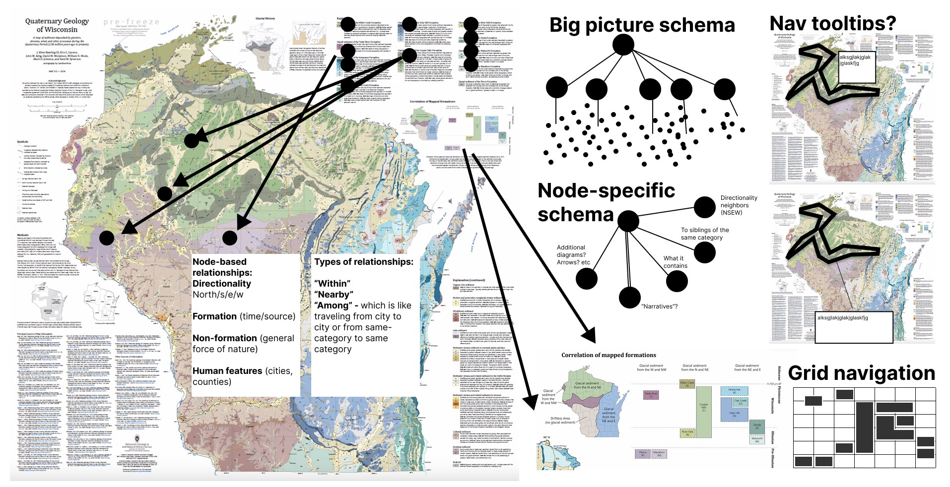
And yet, building these structures (enacting these designs in real, working prototypes) involved working entirely in code (in text) without any visual representation of what they were doing. Testing the designs required interacting with non-visual structures using non-visual tools: loading up a screen reader and stitching together the resulting prototype’s performance interactively, one piece at a time. Testing was not only manual, but also non-visual. This work became quite tedious, prone to errors, and difficult for our fellow practitioners.
Discovering inaccessibility for people without disabilities
We needed to improve the debugging process. And the first step was recognizing that we should probably visualize the data about the system’s structure. Ironic! We are trying to make visualizations more accessible for people who are blind. To do that, we need to make non-visual experiences that can make our visualizations (or their underlying data) more accessible. Yet, because those experiences are non-visual… they are inaccessible to our sighted collaborators!
In the social model of disability, which is a framing that can sometimes be quite useful, we talk about how our created world (be that curbs on our sidewalks, the politics that govern us, or our software) produces barriers for people with disabilities. Those barriers are where a person who has a disability actually experiences that disability. (Again, note that this framing isn’t complete, but it is useful.) What this means is that because we have brought artificial things into the world and those artificial things are now holding some people from participation in the world, it is up to us (the creators) to fix these things.
The social model is useful because it helps us orient who is responsible, who needs to be included, and so on. Great!
But in the social model, the most interesting thing is actually that disability is produced between a human and an interaction with something else. A person in a wheelchair becomes disabled (unable to participate in navigating their city) when a curb blocks their path.
Now, in our research project with Skeleton, we demonstrate that even sighted people can face barriers when working with non-visual design materials. A software system, when inadequately designed, can disable anyone.
Introducing: Our “Inspector” gadget
To address this first issue, we built a simple tool for visualizing the structure under the hood. We call this our “inspector” and also built in custom console menu based on our collaborative work. We figured that the first pre-requisite for any future iterations will require being able to see what navigation looks like.
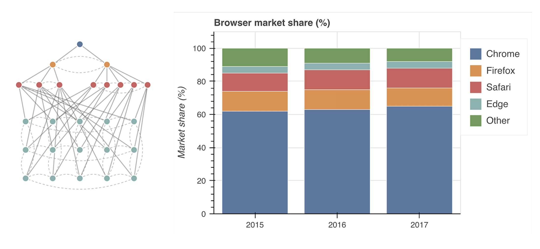
The inspector simply shows a developer what the system “sees:” which nodes exist, and how they are connected to each other through their edges. Interestingly, there isn’t too much precedence for this in terms of accessibility. Web sites don’t expose the accessibility object model and structure, and therefore it isn’t easy for a developer to gain a visual sense of how and where screen readers or assistive technologies will navigate, when navigating on a webpage. This is a huge issue! (So even outside of the scope of our research project, we hope that this catches on in the coming years and we can soon see screen reader and non-screen reader navigation visually over a webpage, when opening the developer tools of a browser. One can dream!)
Introducing: Our alternative “Dimensions”
Our “inspector” gadget is a play on Inspector Gadget, of course. And “alternative dimensions” here is a play on alternative text, the encoding dimensions used in a grammar of graphics (that then correspond to X or Y axes, colors, and so on), and, well, alternative dimensions (from science fiction and the sort). But our tool is called the “dimensions API” and this came about out of necessity, much like our inspector did.
With data navigator, our primary tool for building navigation experiences, we found out relatively quickly across our own work as well as our co-design work that several “patterns” began to emerge as the dominant choices for treating different types of charts and encodings.
With Olli and Zong et al’s work on “Rich Screen Reader Experiences”, they came up with a multi-tree solution for navigating charts and empirically demonstrated that it was useful. In data navigator (our paper portion of the project, at least), we came up with a pattern where children nodes could share parents (or rather, be the leaves of multiple trees at once).
Yet, data navigator’s example patterns were wired up “by hand” in the sense that every data point had a node (or derived nodes) and edges produced manually, by typing everything out in a long and frankly complex specification. Data navigator simply uses a graph under the hood, which is cool and useful, but when it comes to charts and graphs (which often have common structures), this naturally led us to building a higher level API that enabled us to rapidly build useful structures, and especially ones with a structural correspondence to common types of visualizations.
We have a whole walkthrough article written on how the dimensions API works that is worth exploring, in our Data Navigator docs. Also, all of our examples in our “Bokeh Wrapper” (a project we did that didn’t get discussed in the paper) leverage the Dimensions API and also show some of these higher-level patterns for navigation across different chart types.
In brief: the dimensions API enabled us to automatically scaffold navigation experiences based on commonly known inputs that are shared with charting libraries and grammars of graphics. This meant that we could then integrate data navigator into visualization libaries at a low level. Neat! (This enabled our work with the Adobe folks, for example.)
What is missing, though? This seems great!
Well, our Adobe folks are about to solve their design system chart components and we built a wrapper for Bokeh’s visualization library… so what is the problem? Isn’t the work now done?
No, of course not!
The gap that our collaborations helped us to really understand is that authoring (in code) still remains entirely non-visual. We wanted to explore what it would be like to have tooling custom-built for making it as easy as possible to design, iterate, build, test, and iterate again. We built that tool (it is what we call “Skeleton”).
Introducing: Skeleton 🩻
You can find a live, interactive version of Skeleton at this link. We have “save” files for skeleton, too (if you want to load it at a specific view, to see the magic happen more easily than slogging through the wizard for a few minutes). You can access these from Step 0 (upload) and choosing “Load an example.” We have unprepped options (will require using the wizard) but also ready-to-go options that take you to the editor (and let you click the “scaffold” button to see the magic happen) or go straight to testing and poking around with a keyboard or text commands.
Note that this is a research prototype that we built entirely so that we could test our ideas and run a user study. So don’t take the tool too seriously as a production-ready tool. (It isn’t.) Instead, view it as an exploration of our core question and following ideas in one place.
The core question we have centers on: “What happens if sighted designers and developers can author, design, and debug non-visual navigation structures using direct manipulation of visual representations?” (Our paper breaks this question into two separate research questions, but the aggregate combo of them is this, roughly speaking.) And in order to support this core question, our UI was built around the following ideas:
Idea 1: What if you could visually manipulate and author navigation structures?
Put simply: what if you could create something like what our inspector view shows, but entirely in a visual way? Right now, nodes and edges are created using code, then shown in our inspector. And yet, this code is often attempting to re-create a visual design specification. The workflow is: Navigation designed visually -> handoff to developers -> Developers code. But what if we cut out the middle, translational step? What if the same activities we take during the designerly phase (creating markers for navigation locations and drawing paths for navigation) automatically scaffolded the structures that Data Navigator requires? What if you could add, delete, and move around nodes and edges freely by directly manipulating these elements?
So, we built that. We call this view the “editor” in Skeleton.
Idea 2: What if you could auto-magically scaffold the visual part of a structure for most common chart types?
Put simply: the inspector is what the system sees. But we also want to see another visualization: what the end user will see. And yes, many people who use navigational assistive technologies have sight! (We talk about this in our Data Navigator paper as well as demonstrate it in our section on “trouble with focus indication” in our docs.)
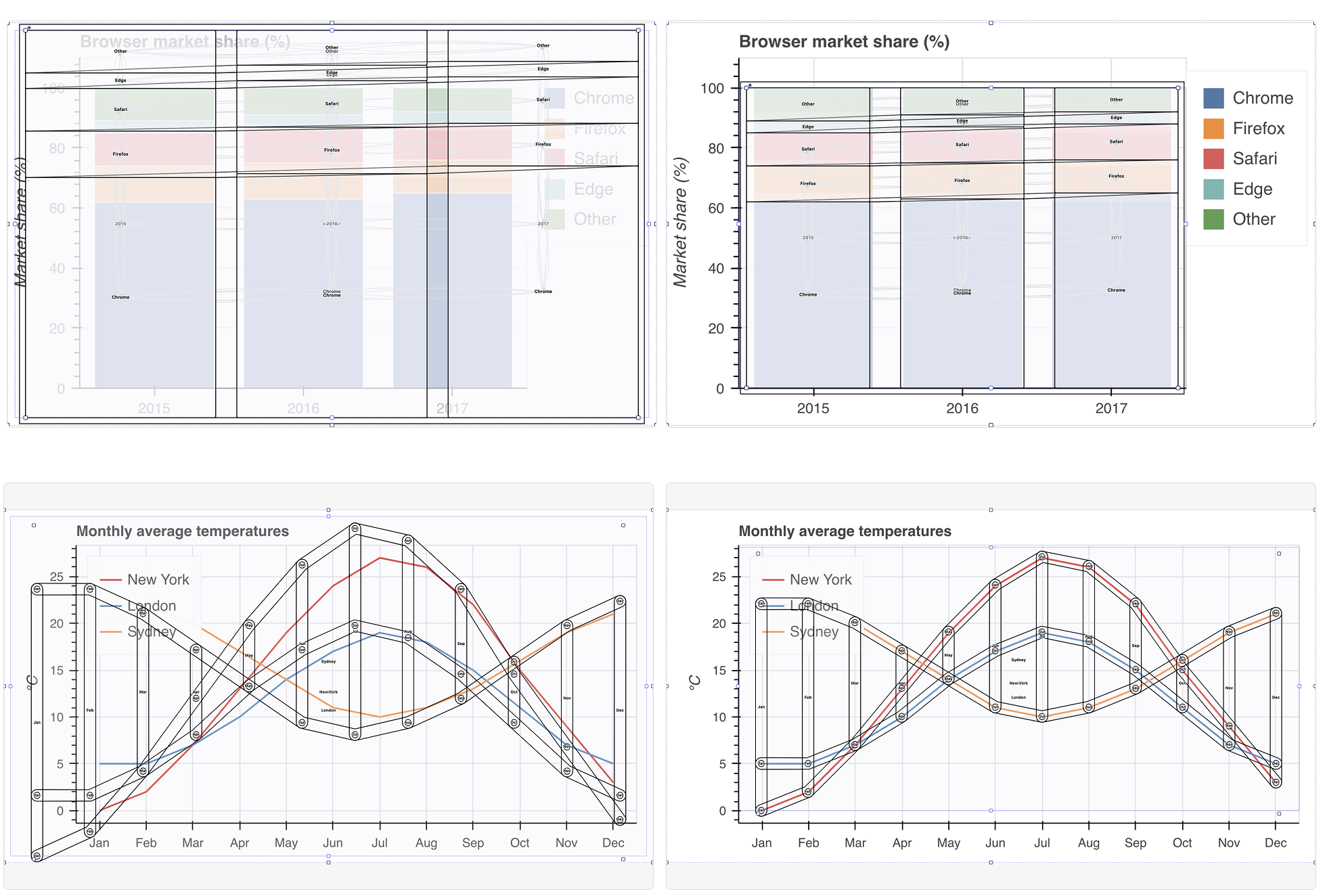
Note: see the figure in the section below on Idea 3 to get a better sense of what the heck a focus indicator or visual outline even means.
But navigating directly over a chart space according to the visual elements and arrangements in that space is what Mei and Pollock call “visual congruence” [1]. Having visual congruence is an important part of making the visual part of a visualization (and not just the underlying data or structure) accessible, too.
Imagine trying to navigate something you see, but you don’t know where your current “location” is. That’s the problem! We need to show users their visual location as they navigate.
This is the hardest part about building non-visual navigation structures (from a technical perspective, not necessarily a design perspective). Knowing where nodes are actually shown visually when a user navigates to one is quite difficult to figure out how to make happen. If a visualization is rendered using pixels… we don’t have access to the location data while someone navigates. Some visualization engines, like Bokeh’s, don’t expose this information. This means that our wrapper for Bokeh actually has to place the real focus over the whole chart, even though we then provide a fake internal focus within the chart (not ideal, especially for users who have a high level of zoom and are viewing a large-format chart).
There are a few scenarios we can engage this (organized by most-difficult to solve to easiest):
Scenario A: Sighted end user has a pixel image and wants navigation added
The hardest scenario to solve for would be an end user who has some sight or partial sight, but still uses a navigational tech. We can’t get element location info let alone data information. Chart extraction methods have attempted for years to pull data out of a rendered chart, but depending on the method and circumstances, the results are prone to error. For example, if a scatterplot has overplotting, then significant data is lost. Not ideal. But computer vision could at least help find locations and reverse-engineer the element locations and data values.
Scenario B: Completely blind end user has a pixel image and wants navigation added
In this scenario, we don’t need to place elements in any particular spot visually so long as the structure is correct for them to navigate. This unfortunately still has the same problem as before in cases of overplotting, as it still requires chart-data extraction methods. Not ideal, either but not quite as hard.
Scenario C: Dev user has access to the data, sends it to a visualization library to render pixels
In this scenario, now we are cooking. Rather than placing the burden on the end user (and likely creating an unsolvable or unideal experience), we can go one level up to the authoring process: the moment that a developer passes a dataset (and some kind of specifications) to a charting library, visualization tool, or grammar.
The user might be a journalist making a chart using a tool, a business analyst building a report using excel, a web developer who is leveraging a canvas-based tool like Bokeh, and so on. The “user” here isn’t an end user, but a developer- or designer-user. They have a dataset and a charting tool. And at this intersection, we can solve quite a lot of problems! (We unpack this below, because it is the hardest-to-solve scenario that we believe we can solve. But we will still outline other scenarios, those that are more ideal than this one.)
Scenario D: Dev user has access to the data, sends it to a visualization library to render SVG
If we have SVG? we can reasonably extract the locations of rendered elements. This isn’t easy, per se, but relatively speaking this is trivial to solve for now.
Scenario E: Tool-maker is building a charting library or tool
In scenario E, we can also easily solve our problems. In the context of building your own charting library (like we did at Visa via Visa Chart Components or in our collaboration with the folks at Adobe building React Spectrum Charts), the library itself has access to its own rendering engine. That’s the point of the library, after all! And if you can hook into the lifecycle of drawing things, then you can figure out where those things are when it comes time for a user to navigate (even if those things are rendered in a pixel-only format).
The “Scaffolding” tool (and solving for Scenario C)
(Recap on this scenario: So a developer is using a tool that creates pixel-based visuals for them, say Bokeh or Excel or something. The user has their own dataset, which they use as input for their tool. After rendering, they want to make a navigation experience for users of assistive technologies.)
This scenario has input data and input specification (aka chart type or encodings) from our user. We believe that this is enough to automatically add visual congruence to a navigation experience!
This is where we had some fun ideas. Why not use another charting library to gain access to element location (by effectively replicating the user’s own visualization)? We can throw away the visualization we replicate after getting the location information we need, too. So this is just a temporary, deterministic calculation step. Visualizations all use the same fundamental math to translate a domain into a range. D3’s whole “scales” ecosystem exposes this. So, what if we just re-render a chart that mirrors the one the user started with? We did this, and it works beautifully (with one single caveat, below.)
For our “scaffolding engine” (as we call it), we used Vega. Vega exposes element location in their view model. We conjectured: what if we take input data from our users, get info about what type of visualization is rendered (or encodings used), and then not only can we automatically build a navigable structure but we could also automatically scaffold the locations of the elements in that structure!
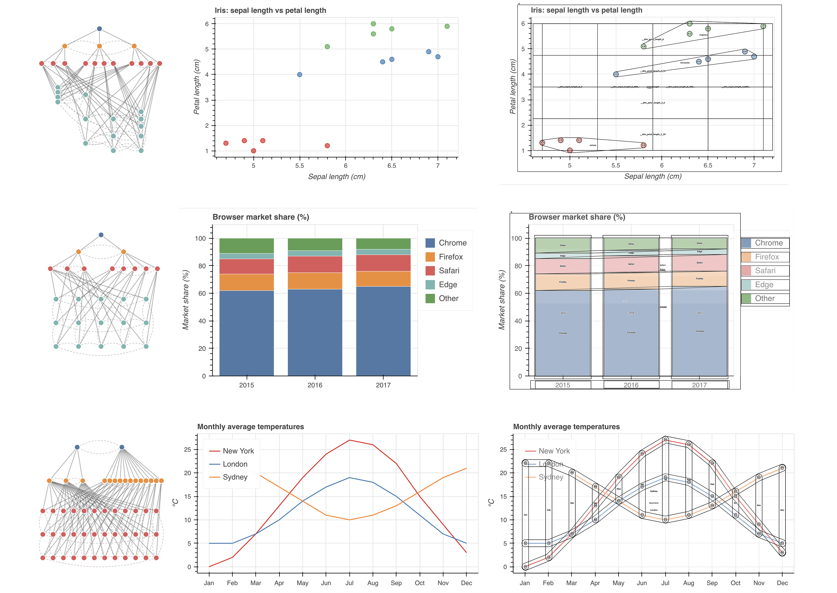
Now, scaffolding isn’t actually all fun and games. We do a little bit of dark magic in order to get these outlines to fit properly. Namely, we really only used our scaffolding engine to extract mark locations, group information, and so on. We also need to solve for two other things, first: how to outline different groups of marks. And also: how to figure out exactly where the mark space is rendered. Visualization tools employ a lot of different opinions about how to pad around the mark area. Axis labels need to be considered, as well as other things like a legend, generic padding, subtitles, captions, and so on. We can’t assume that the cartesian coordinates for 0,0 on our mark space is relative to the 0,0 absolute position on our input chart!
For shapes and outline strategies, we simply built a generic library devoted to different geometric strategies (convex hulls with padding allowable, rect outlines, union of all child outlines, and so on).
For finding the padding, we do a little heuristic based (non-ml) computer vision pass, to estimate where the mark space begins. (For details about how we did this, simply see the appendix of our paper or our open source code for skeleton.)
Idea 3: What if you could test navigation without even using specialized tech, like a screen reader?
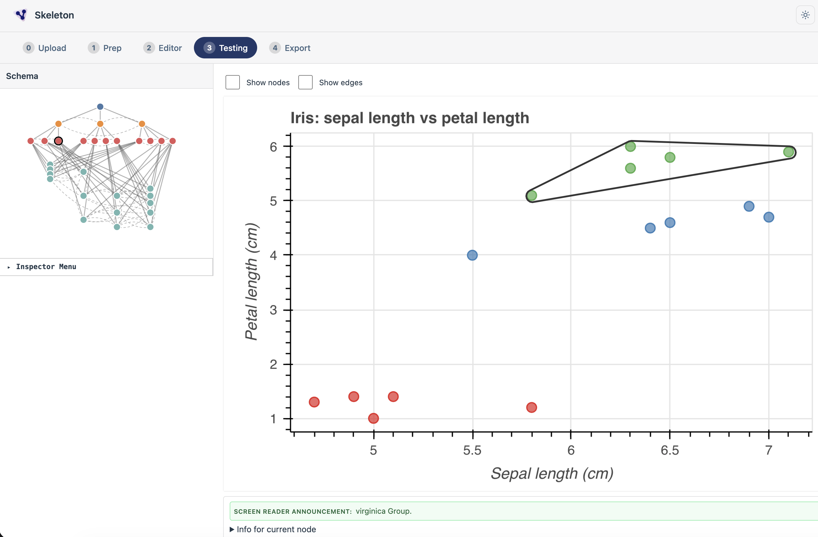
Lastly, we wanted people to be able to immediately test their designs both functionally (does navigation operate as expected? do the correct relationships exist?) as well as visually (are elements in the correct location? are groups outlined in a reasonable way?) and non-visually (do the labels that are generated for a screen reader user make sense? can someone figure out how to explore this non-visually using our text and alt text alone?). And this became our testing page! No screen reader required. This page replicates chat based navigation (typing commands), keyboard nav, as well as screen reader nav (complete with visual previews of the otherwise-hidden alt text for each element).
Our study and findings
Honestly, you should read the paper for all the juicy details of our study. It was a blast. The study design was simple: we used our prototype for Skeleton as a “design probe” to surface qualitative insights about how people orient and reorient their work while trying to make visualizations accessible. We had users do a “test run” of the tool, where they tried to make a visualization accessible (and we intentionally included a bug fo them to possibly find). After the test run, we asked them to bring an image of a visualization they are currently or have recently worked on. At the end, we had an interview where we asked some semi-structured questions. All of our participants were visualization practitioners in some role (as engineers, designers, data scientists, or researchers).
Since Skeleton became the final proposed project in my thesis, I also pontificate/reflect a bit on the chapter (chapter 6) in the thesis as well. My biggest takeaways are:
- An improperly designed system can produce barriers for anyone, even people who are sighted. This means that sighted people need barriers removed and yes, even people without disabilities require our world to be accessible. “Accessibility is for everyone” has long been understood as this idea that everyone experiences situational limitations or temporary disability (or we all age into disability if we grow old enough). But in our paper, it is clear that “Accessibility is for everyone” also means that poorly designed software or a user who is trying to do work in a modality that is unfamiliar to them will require accessibility too.
- Making non-visual elements visual and directly manipulable shaped how sighted practitioners thought about the design problems. They stopped thinking as much about compliance or what was “required” and began to recognize that navigation is its own space of design consideration.
- Making non-visual elements visual, such as text read out to screen readers, led sighted practitioners to heavily iterate (independently! they were not asked to do this). They went back and forth, clearly thinking through the ideal, low-level details of a blind user’s experience navigating a data structure.
- Making non-visual elements visual, such as the paths and elements of a navigable structure, led sighted practitioners to heavily iterate and even reconsider their visual designs (their own charts and graphs), because they recognized the relationship between their visual design choices and the non-visual experiences that users would have.
- Making non-visual elements visual and directly manipulable actually influenced one practitioner to decide that navigation was a poor design choice for the specific, bespoke chart they had brought. They decided that navigation didn’t make sense for their chart and instead opted for non-design. (Really cool and surprising choice!)
- Ultimately, sighted practitioners think and reason about design in visual ways. And by making non-visual elements legible and interactive, we saw them re-prioritize and reconsider the design of non-visual user experiences. A step in a very interesting direction for future work and future accessibility tools!
What’s next?
Well, Skeleton the idea has been thoroughly tested. But Skeleton the prototype user interface has significant hurdles to overcome before it is really ready for public use. It is full of bugs and assumptions, the code is poorly optimized, and t lacks one of the most important features that will determine its success: exporting what you build with it. Right now, Skeleton let’s you import, prep, edit, and test. But you can’t export, so it is only useful as a design tool. Once we lock in on exporting functionality and build it out, it’ll become far more useful for most designers and developers. More to come!