Minimalism and the absurdity of the data-to-ink-ratio
How much minimalism is too much minimalism? I explore this question and propose the most minimalist, highest scoring data-to-ink ratio on a visualization ever made as a thought piece. Why? Well novices learning to make data visualizations are often taught to avoid 'chart junk' and strive towards visual minimalism. But they aren't told when to stop.
Edward Tufte’s books, “Visual Display of Quantitative Information,” “Envisioning Information,” “Visual Explanations,” and “Beautiful Evidence” combined have 29,010 citations as of April 22nd, 2025 on Google Scholar. To say that Tufte has been influential in the field of data visualization would be an understatement. Few others have contributed as much impact as Tufte to the spread of ideas related to my field of work.
Tufte has 2 specific ideas, both fixated on the design philosophy of minimalism, that I’d like to discuss in this piece: “chart junk” and his “data-to-ink ratio.” “Chart junk” is a label given to visual decorations that are considered superfluous, meaningless, and even harmful to the central function of visualizing data. And the “data-to-ink ratio” is a rough heuristic for maximizing the information that a graphic can portray in as little “ink” (visual marks of any kind) as possible.
Both of these ideas have been hotly contested in the visualization research literature. How do we really know whether visual decorations are harmful? First, how do we even consider something is “chart junk” and then second, how do we observe what effects chart junk actually has? And with the data-to-ink ratio, how do we objectively measure what data is, and then how do we accurately measure the ink used to communicate that data?
Exploring these questions has been about as effective as bringing a squirt gun to fight the ocean. Empirical research (unlike Tufte’s opinion-based approach) has comparatively nearly 1/20th the collective citations as Tufte’s thoughts. Even if researchers are right in questioning easy, un-nuanced design notions like “chart junk” or the “data-to-ink ratio,” we are virtually powerless to stop the force of Tufte’s immense existing impact on how people think about visualization.
If you can’t fight the death grip of minimalism on modern thought… can we embrace it to the extreme?
So perhaps we cannot “win” in the marketplace of ideas against someone like Tufte. Easy-to-recall rules that make young professionals feel like they have powerful expertise over a complex domain like visual design are hard to conquer. Essentially, asking for measured, mature designerly consideration is simply not as popular (and perhaps never will be) as giving someone fast, naive design heuristics.
So what if we just take Tufte’s idea as pure law? What if we made a visualization with as little chart junk as possible and the largest data-to-ink ratio score imaginable?
Here, we will work with a simple data that has 2 columns. The first column is categorical and the second is quantitative. The data represents the frequency of letters, rounded, as they occur in a collection of English texts (from wikipedia). We will try to maximize our data-to-ink and visualize this as minimally as possible.
| Letter | (%) |
|---|---|
| a | 8 |
| b | 2 |
| c | 3 |
| d | 4 |
| e | 13 |
| f | 2 |
| g | 2 |
A bar chart might be our first attempt to show this data:
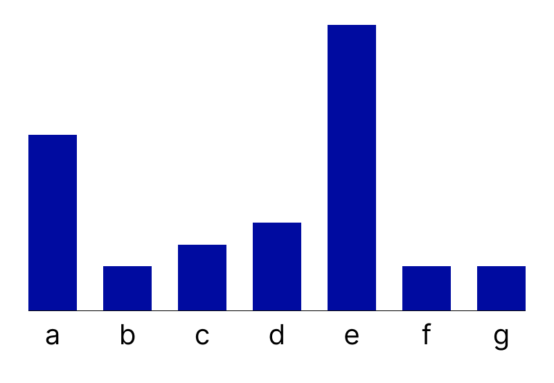
So the bars technically have pixels, since this is a bitmap image. That means we can quantify our ink usage here. (For now, let’s not count the pixels of our use of text.) So the bars have a hue encoding as well, so there is a second dimension encoded here. We will add up the pixels of all the bar heights (1081 pixels) and then multiply that by the width of the bars (70) and then again by 2 for using a color. We also have an axis line that is one pixel thick and 718 pixels wide, we will want to add that on to the previous total. So for now, we get a total “ink” value of 151340 + 718. Since data is a constant, we can set that to 1. Our first design’s data-to-ink ratio is 1:152058.
So technically the hue here isn’t adding anything. And the axis line is useless too. Plus, the contrast of the text is too high. (We aren’t counting text here towards our ink score, but let’s reduce that anyway.)
To fix this, let’s use the lightest contrast colors for geometries (#949494) and text (#767676) that we can while still passing accessibility standards. (Technically, we still want to be “accessible” according to standards! We can’t go too far in hue and lightness reduction…)
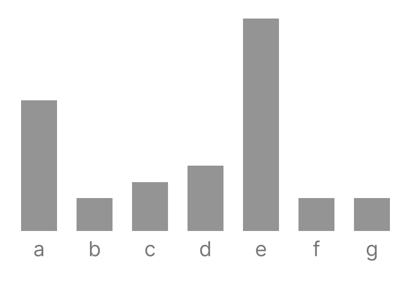
Well, if we calculate this ratio for this one, it’s much lower. The 718 from the axis line is gone and the hue is removed, so that extra dimension is gone. This one is 1:75670; better but we can go a lot further. That is still far too much ink.
In Tufte’s fashion, (I don’t remember which book this is in) but we can acutally get rid of all the useless filling of the bars themselves and just leave the tops, marking the only part of their position that matters.
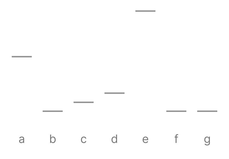
This chart is much better! Now we’re much more minimal. So each of the 7 bars are only 5 pixels tall. That’s 5 tall by 70 pixels wide by 7 marks total. Our data:ink ratio is skyrocketing now, at 1:2450. We’ve gone down a whole order of magnitude!
But honestly, why did we stop there? Why waste all that ink making these bars so wide? We can take this design further.

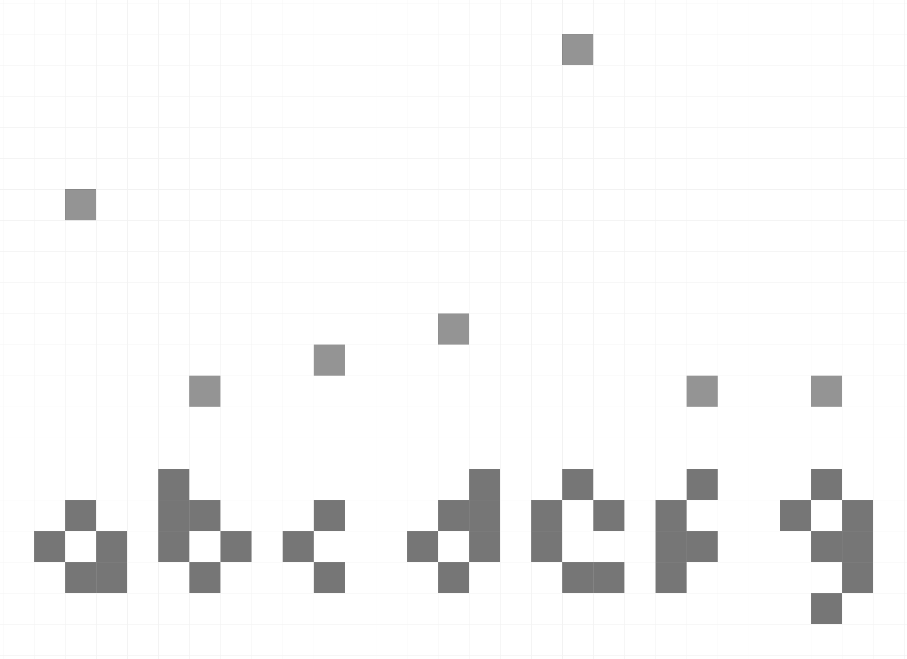
Now each mark is only 5 pixels wide by 5 pixels tall. At 7 marks, that’s a data:ink ratio of 1:175. We’ve gone down another order of magnitude!
Well some of you might be looking at this design and find it hard to perceive. Well guess what? That’s what minimalism is all about! Technically, according to accessibility standards, there is no regulation for minimum sizes. This is not only a highly-efficient, chart-junk-free visualization, but it is also technically accessible! Amazing.
But yes, you guessed it: we can go even further.
Dear reader: are you familiar with what “code golf” is? It’s a sport (of sorts) where people attempt to reduce the number of characters they use in source code in order to solve a problem. It tends to result in comically terse, virtually unreadable lines of code, but it still gets the job done. One of the best places to witness this recreational exercise is over on the code golf stack exchange.
So what if we go to the extreme here with our data-to-ink ratio? What if we try to visualize our data using the smallest amout of ink possible?
For this dataset and using a modern, pixel-based display or rendering, I believe that this is the solution:

Each data point is represented by only a single pixel! For our dataset of 7 points, this data:ink ratio is a massive 1:7. This would surely make Edward Tufte happy! Obviously, this is the pinnacle of data visualization design!
Minimalism has been a way for some “intellectuals” to enforce aesthetics as law
So while this exercise was meant as a playful exploration in my new sport, “ink golf,” I do want to make the point that the graphic above is obviously inaccessible in its design.
Virtually nobody would find this design useful or effective and it is likely an unusable artifact. I am certain that Tufte wouldn’t defend this design with any seriousness, and certainly wouldn’t intend for his philosophies to be taken this far, either.
But yet, followers of minimalism always seem to stop at a certain point. Why? Why stop once you, the author of a visualization, are barely able to see what you’ve made? How do you know that what you see is adequate for what others see? Is your perception of minimalism the same as your audience’s? Is minimalism, with so few real rules or empirically observed benefits, worth defending with such passion and fervor?
Minimalism becomes a barrier, if taken too far. And this is the question I want to raise: when is too far? When do we decide that minimalism is excluding people from using our data visualizations?
Accessibility standards don’t save us. They currently don’t set a minimum size for text or objects in a visualization.
We do have plenty of research on “Just Noticeable Differences” or JNDs, however, but these aren’t modeled after people with visual disabilities like low vision or blindness - so using these models wouldn’t be helpful if we really wanted to know when minimalism starts to hit practical limits in design.
So my lesson for you, dear reader, is this: don’t take minimalism so seriously. The data-to-ink ratio is not a law. And as Derya Akbaba says, perhaps it is time to put the idea of “chart junk” in the trash too.
For fun, here is a zoomed in version of my ink golf solution, so you can see that I even custom-made a font in order to make this as small as possible. I reckon there might be some pixel configurations that can represent these letters in fewer pixels, but I couldn’t solve it. I suppose that’s the fun of golf - perhaps a lower score is possible! You’re welcome to give it a try, as long as you remember that minimalism should be used for fun more than it is for any sort of deadly, professional seriousness.
(May 12th) Addendum: responses to “ink golf” on social media
Well, I’ve had a blast over the last few weeks interacting with folks on social media with this.
Linkedin, for the most part, still had fun. However some were deadly serious about my abuses and misrepresentations of Tufte’s “theory” (in particular the caveat that the data-to-ink ratio is meant to be followed “within reason”).
Ah, of course! If only I had read the holy text close enough. “Within reason” is so concrete, clear, and helpful! (In truth, knowing what the “reasons” are is, of course, most of the battle. This is why the data-to-ink ratio is a rough heuristic and not even remotely a real, working “theory” of any kind.)
Linkedin is being very normal about this, by the way
— Frank Elavsky ⌁ (@frank.computer) April 23, 2025 at 4:10 PM
[image or embed]
Bluesky has had a lot of fun by comparison, we even “ink golfed” just like folks do with code, incrementally iterating closer to various solutions together. Some favorites:
Text reduction
First, folks focused on reducing the pixels of the text. Of course, using English was short-sighted of me (pun intended). Turns out that braille-as-pixels is much more efficient:
if you're gonna argue with minimalism, which is simply The Right Way, you should do it without standing up a straw man. the optimal solution here is clearly using Braille for the column labels, which reduces the true data-ink ratio from a measly 1:45 (yours) to an impressive 1:24 (mine). </sarcasm>
— István Korompai (@kpisti.bsky.social) April 23, 2025 at 9:49 AM
[image or embed]
But if we don’t need English, do we even need human language at all? What if we could mentally map letters to pixel positions? Reducing pixels is more important than anything, so this makes sense to explore.
The order of letters in the alphabet is set, so technically you don’t even need the labels.
— Robert Simmon (@rsimmon.bsky.social) April 23, 2025 at 11:50 AM
[image or embed]
A rather cerebral take in this direction:
Cut the intermediate braille labels for even more information density! (people should of course be able to infer that the categories are in alphabetical order between a and g ;) )
— Randy Boyes (@randy.pub) April 23, 2025 at 12:23 PM
[image or embed]
Reaching the QR-Code solution
From text reduction, two threads emerged. The first thread was on new and creative ways to encode the data into smaller spaces, specifically using a QR-code-like set of rules (the cropping is poor on these, clicking them shows how they work). Depending on your counting method, this uses 7 to 10 pixels for the data and the “text:”
and if we do need exact precision, we can binary encode each square! break each data point into 4 squares, color each subsquare black or white, then add up the black subsquares to get the value extremely intuitive and user friendly
— shri (@shrikhalpada.dev) April 23, 2025 at 12:46 PM
[image or embed]
After discussion, the design became clearer:
Lmao incredible. Basically interpreting a home-cooked QR code.
— Frank Elavsky ⌁ (@frank.computer) April 23, 2025 at 2:37 PM
My advisor, Dominik Moritz, remarked “you could probably put everything into a QR code, if it really is about efficiency.” So, I reckon that this method scales well in theory.
Reaching the best ink-human-interaction solution
But if it feels like “cheating” to turn data into a QR code (since that is mostly for machine interpretation), perhaps it makes sense to focus on human interpretation?
so, this is the final form? I'd argue it's truly minimal, we even managed to remove any morsel of meaning from it
— István Korompai (@kpisti.bsky.social) April 23, 2025 at 3:16 PM
[image or embed]
This can be reduced, if we assume certain patterns:
You can cut one more pixel if you're willing to assume you can interpolate to get blank points
— Randy Boyes (@randy.pub) April 23, 2025 at 3:25 PM
[image or embed]
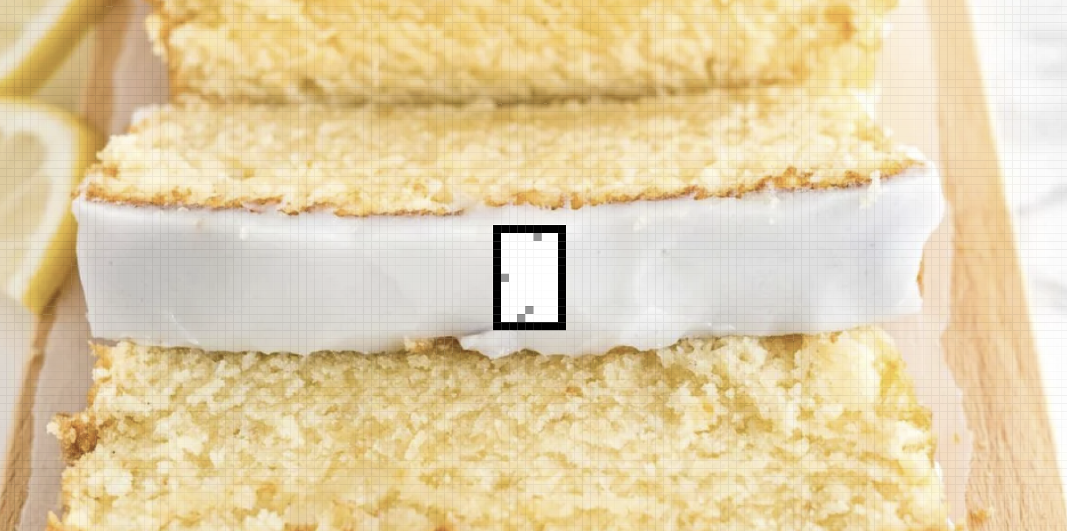
And my final solution using 4 pixels, which I think is the best solution for this particular data (as long as we actually show pixels and focus on some human sort of rules for interpretation):
Wait... I'll do you one better. What if we follow your lead here but instead truncate the axis based on the lowest data value - it happens to be shared by 3. This means we can interpret any missing pixel along the x as the lowest value! This results in a 1:4 ratio for this dataset...
— Frank Elavsky ⌁ (@frank.computer) April 23, 2025 at 3:41 PM
[image or embed]
The ultimate solution: visualize in your head
Of course, the immortal Eugene Wu took our methods to their logical extreme (in the true spirit of the sport of ink golf): to reduce ink as much as possible, the reader simply must read the data and then picture it in their head! This is, of course, the solution that scales the best to all other datasets and also requires no ink at all (unless “brain ink” is a thing?).
Bravo! The game has been won:
Since you are making assumptions about what the reader knows (axes, weird encodings), then if you also assume the reader is already familiar with the points, show an empty image. 1:0
— ewuuu (@eugenewu.net) April 23, 2025 at 4:34 PM
Reflections
It is clear that the seriousness of something so loosely defined as a “data-to-ink ratio” still has a chokehold on the minds of business-y “thought leaders” in the large space of visualization. Tufte’s “laws” really do rule the thoughts of ink-bros still, even when we show them data otherwise.
So I hope that this playful exploration has demonstrated that minimalism really is rather absurd.
Understanding “ink”
For anyone interested in a rather lovely exploration of philosophy and ink, Tony Fast (a wonderful friend) recorded a stream reading this blog post while creating some art. It was lovely.
I do think that focusing on “ink” as a design heuristic is outdated. This mattered when strokes had to be precious, because there was also a cost of production and printing to keep in mind. Lighter, fewer marks made for cheaper prints.
Further readings: minimalism and fascism
Ronke Babajide writes about how “Minimalism is Rooted in Fascism” in a great introduction to what I believe is one of the most important things to actually keep in mind when we critique minimalism. This blog was meant to be silly and absurd, to make a game out of minimalism. And as a tool, it has also historically been tied to white supremacy, as Charlotte Eckardt writes.
The tie here isn’t that minimalism is somehow inherently fascist as an idea but historically and culturally leveraged by fascism. Historically, Adolf Loos’ minimalism came about as an aesthetic resistance to the opulence and ornamentation of the old, dying empires of the pre-1900s. (IE Fancy ornaments were seen as bad; stripping them good.) This gave rise to an aesthetic that was highly legible to political parties: it was an identity separate from opulence and nobility. Due to the time and place of this emerging aesthetic in central Europe, it found a home in fascist architecture, clothing, and ideas.
In contrast, Marie Kondo’s anti-consumerism, modern ascetic movements (“ascetic” not “aesthetic” mind you), the hippie/hipster buy-local and DIY movements, and so on are probably not at risk of being fascist. Plenty of minimalisms are fine, largely because they are responding to consumerism, waste, and clutter through self-disclipline.
But some minimalisms are clearly legible and useful as tools of policing, enforcement, uncritical obedience, and generating aesthetic uniformity. Minimalism’s greatest weakness is that it is aesthetically reactionary, ideologically and historically. In a sense, many things are reacting to older things. But minimalism is often reactionary without being generative. It deconstructs; that is its aesthetic purpose. For this reason, it is ideal when coupled with politically reactionary movements: the idea that foreigners, outsiders, and minorities are “clutter” or that cultural markers must be removed in order for a better aesthetic to be laid bare.
The idea that the “true” identity of a thing, be it a building, visualization, or nation, comes about when things are removed is a dangerous notion. My lesson here is that minimalism, and really any reactionary politic or aesthetic, should be approached with great care.
Fascism, white supremacy, and minimalism are in my my mind as I watch the latest season of Andor:

Minimalism, especially with clean whiteness and obsessive control over any and all natural, organic characteristics, has strayed far from philosophies that focus on simple living, anti-consumerism, and humility.
And again: I don’t make the case that minimalisms in all forms are morally wrong. I certainly don’t believe that; but I will argue that modern uses of minimalism-as-empire and minimalism-to-control-others are. Minimalism, especially in Tufte’s data-to-ink ratio, can often become a tool to police the acts of others.
Maximalism, decoration, and embellishment
I joked with Tony after he sent me his stream where he inked in response to my blog, that I’d love to see ink golf evolve into a game with very specific rules and counter-rules.
For example, perhaps it makes sense to create an outline around the “playing area” (a magic circle, if you will, for the game of ink golf). Whatever is inside the boundary is measured with intense scrutiny, as we demonstrated previously. But this would mean that, for the sake of play, whatever is outside of the bounds is fair game.
Perhaps a culture of itasha would emerge, specific to ink-golfing (this is one of my favorite hyper-decorative subcultures). Or perhaps a specific counter-culture of tag graffiti would become popular, where people would deface the outside area of other people’s ink-golf submissions. My favorite example tag graffiti paradoxically respecting certain rules: tag graffiti artists will avoid spraying over labels on trains, so that they either respect the safety/value that the labels accomplish or are just trying to maximize the chances that their tags don’t get painted over.
So in an imagined hyper-culture of ink-golf, there might be some purists and some rebels, when it comes to rules-permitted decoration. My previous “solution” could instead look like this:
Plenty of good designs use a maximalist approach and I think they work quite well. For example, I play World of Warcraft with my wife. Many of the visualizations used by the websites tracking player data are quite maximal in their design:
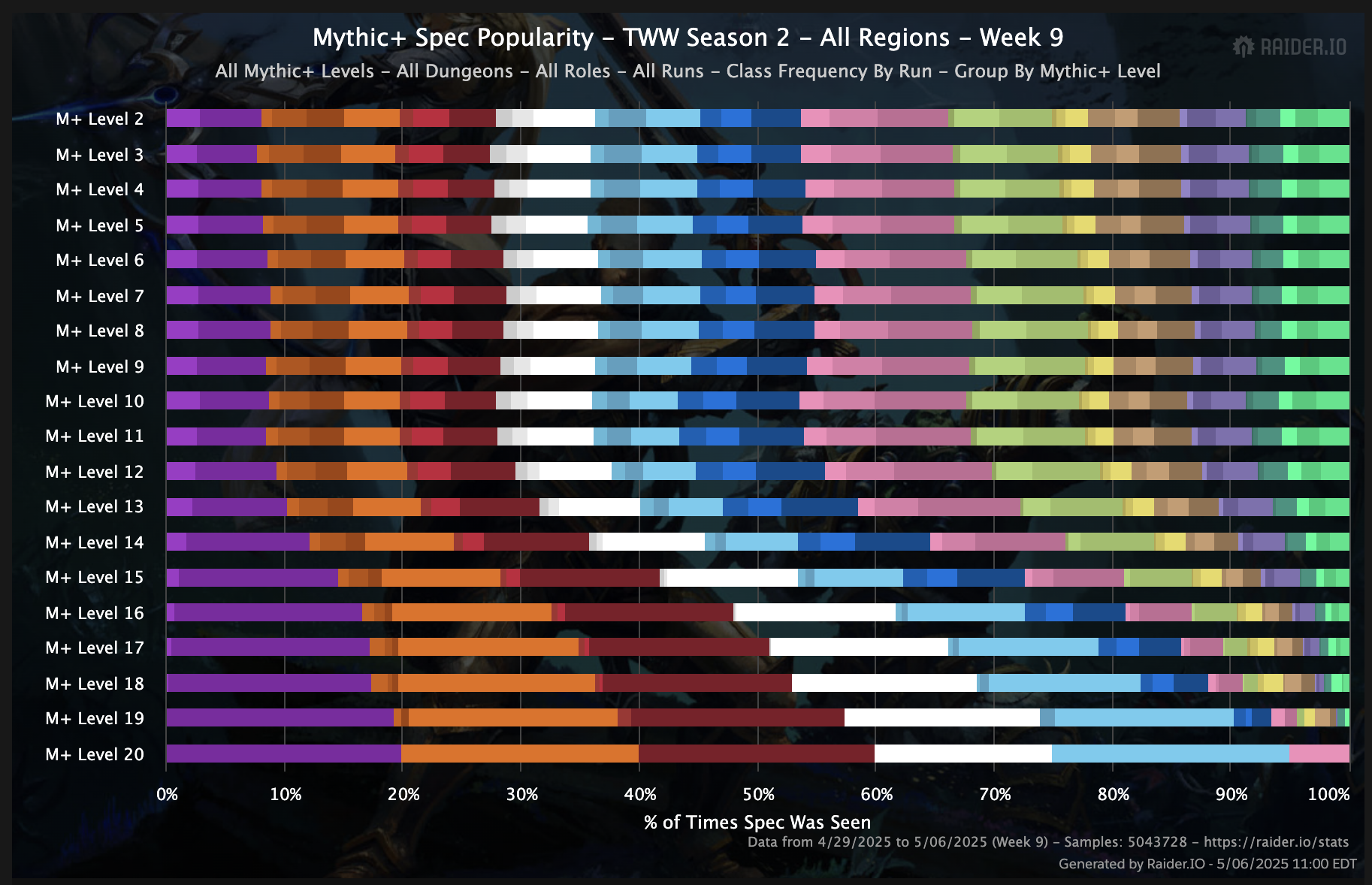
But look at all of those colors! Of course, every color is meaningful and represents something in the data. It might appear to have noise, but it is mostly full of signal. Maybe this would make the visualization minimalists happy? Is 35 different categorical color encodings a good design choice? Most recommend 5-7, some even recommend only 1 or 2 colors and use different methods than color for encoding (position, small multiples, etc). But I think this design choice is fine. It works well if you understand what the colors mean (they all map to a class specialization, which is a color scheme repeatedly used in-game). For this use, it’s probably a totally acceptable design, despite breaking a zillion “rules” of visualization design.
But what is that behind the chart? There does seem to be some pesky decoration here… Let’s look at a different chart to see this better:
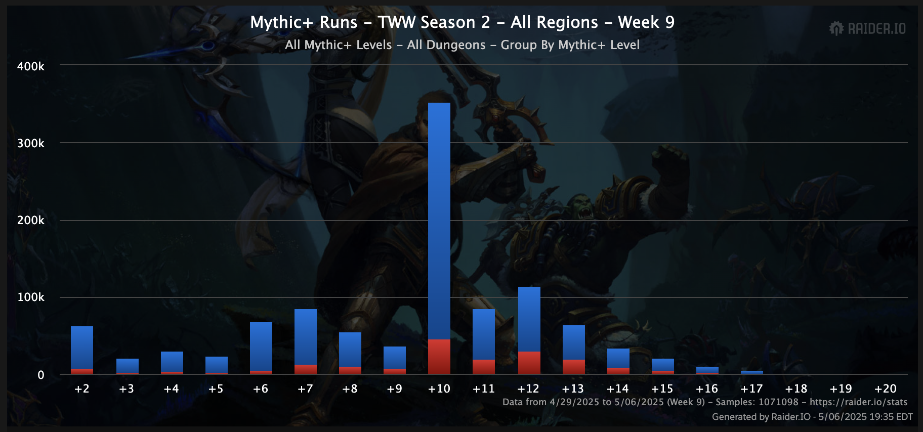
Uh oh! Now this is illegal embellishment, for sure!
I wonder what the earliest founders of data visualization would think about this? What would the progenitors and originators of our craft think? Let’s check in with them:
📊 I recently But found another pre-Playfair example, this by an unknown (to me) German, C.G. Porsch "Of the heights of the great watercourses of the Elbe River, near the town of Meiffen, Dresden, and the Electorate of Pilsen, from 1501 to 1784." From: deutsche-digitale-bibliothek.de
— Michael Friendly (@datavisfriendly.bsky.social) April 26, 2025 at 11:09 PM
[image or embed]
In any case, there is quite a lot we still don’t know about the use of decoration (or “embellishment”) from a research perspective. Maybe some of these designs actually aren’t that bad. Embellishments probably help make a visualization more memorable, they probably also really help with marketing and sharing (which is especially important for the success of truth). Visualizations can be co-opted for evil as well as leveraged for good.
So perhaps it is far more important for us, once we establish that we are visualizing towards honest ends, that we work to have an impact as well. Visualizations are often cultural artifacts, so they should participate in our cultures as well. The one thing we should really question in our designs is if minimalism’s demand to strip ourselves of our cultural artifacts is worth it. Perhaps we should situate our designs more in the decorations and embellishments of our times, that matter to us.
We might stand a chance in the war against dis- and misinformation if we could catch people’s attention better than clickbait.
So the takeaway of this blog has now shifted from a joke poking fun at minimalism to a call to action: use maximalism for good. Catch people’s attention, keep it, and make more memorable, meaningful visualizations.