Introducing Data Navigator
I'm happy to announce my latest project, Data Navigator! Making interactive data visualizations work with assistive technologies that navigate content is complex and difficult work. Data Navigator aims to make this easier.
The short and sweet of it
We designed a system that developers can use to make their data visualizations navigable. This is important for supporting assistive technology input as well as the design of future data navigation interfaces.
We have a lot of work left to do though: now that visualizations can work with different assistive technologies, it’s time to co-design, validate, and establish what it means to create good data navigation experiences.
Here’s a 25-second video introduction to our project:
Everything for our project
Want to get started? Here are all of the links related to Data Navigator:
- Our demo application: almost everything cool about Data Navigator in a single demo.
- Our HTML paper for Data Navigator: an in-depth, academic-focused walkthrough.
- Our codebase on GitHub: if you want to check out our codebase, typescript types, and follow for future developments.
- Data Navigator on NPM: if you’re ready to get started and try it out.
The rundown: Why make a tool like Data Navigator?
We’ve made great strides in recent years for data visualization accessibility.
In Chartability, my set of guidelines for accessible visualization, there are 50 different things worth checking that can cause barriers for people with disabilities. And I’ve performed over 120,000 tests with Chartability to date. Every data visualization I’ve evaluated contained at least one failed Chartability test.
So by and large, most all data visualizations out there are still inaccessible for people with disabilities. Practitioners use different toolkits for different reasons and every toolkit treats accessibility in different ways. The tools we use have a downstream effect on the quality of accessibility a visualization is capable of but some are much further behind than others on what they offer.
I’d like to think that I have a good sense of what many different toolkits are capable of. I even wrote a chapter about this for the Urban Institute’s Centering Accessibility in Data Visualization publication.
With what I’ve seen, by far the hardest problem for practitioners to overcome is making their data visualizations accessible to assistive technologies, like screen readers. Beyond screen readers, many other assistive technologies are also largely unaddressed by visualization toolkits. People with motor and dexterity disabilities may not use a mouse (or pointer based) input, and instead use technologies that navigate or directly access content instead (like keyboard or voice based inputs).
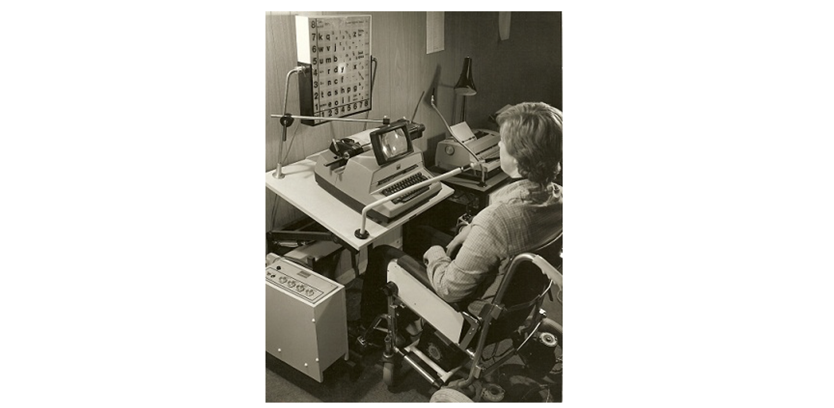
And these input devices have been part of computing for a long time. For example, below is a photo from 1960 of a wheelchair user who is leveraging a sip-and-puff device, which controls input and navigation using breathing patterns (credit).
We’ve had great solutions that have come about in recent years that engage navigation: Sorge’s work on chemistry diagrams and Zong et al and Blanco et al’s work on hierarchical approaches to data structure that work great with ordinary charts and graphs.
But how do other data visualization practitioners implement these patterns in their own environments? These prior solutions all use JavaScript on the web. But many other charting libraries have to come up with a way to follow ideal practices.
And how do data visualization practioners add navigation to visualizations that aren’t reasonably represented by existing approaches? For example, spatially navigating a map has no established, existing solution or best practice to follow yet maps are one of the most common forms of visualization.
What is needed is a system design that can be implemented in other environments and is capable of representing new and unaddressed data visualization types.
Contribution 1: A simple, yet powerful system design
In Data Navigator, we do this: our first contribution is a user interface system design based on a graph structure. A graph is built on nodes and edges, which are a fundamentally different substrate than most UI materials (HTML for example is hierarchical, so it has branches and leaves).

Nodes and edges can construct any other data structure. You could, of course, build something like HTML’s branches and leaves using nodes and edges (a tree is a subtype of graph that has a few rules added). Nodes and edges can create lists, tables, hierarchies, networks, geospatial structures, and more.
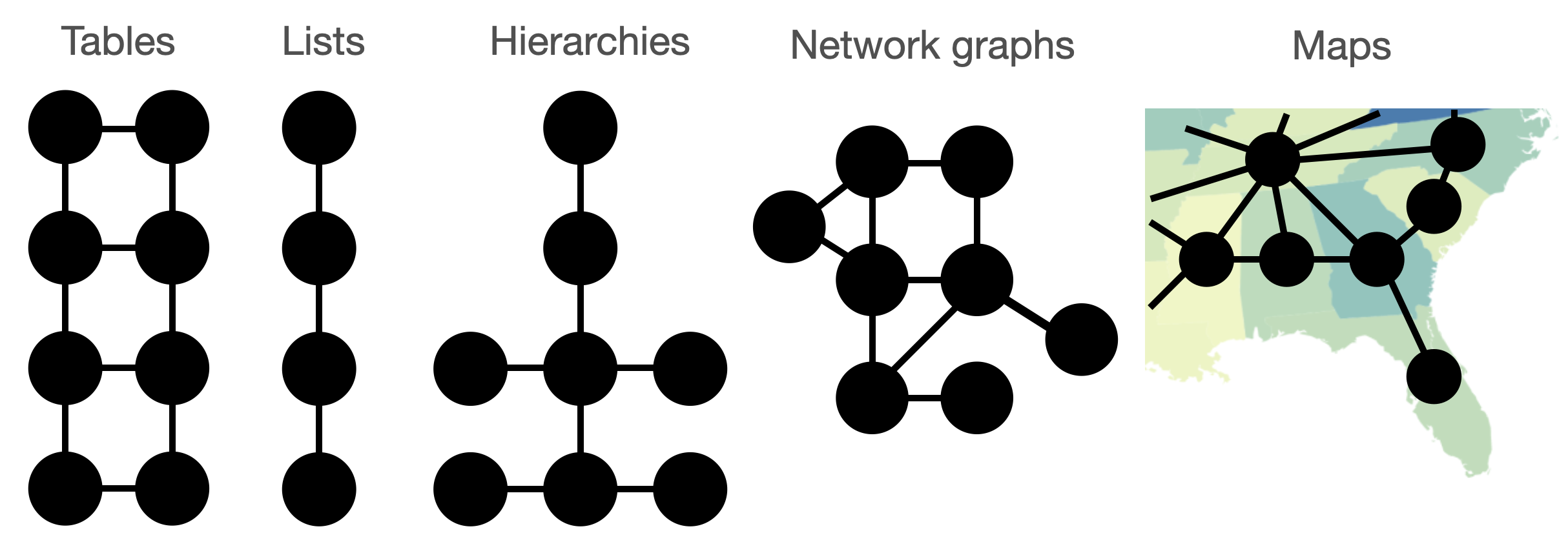
And edges serve to create relationships between nodes, which is essential to building an infrastructure capable of rich navigation. Our edges can be created with navigation “rules” in plain, human language. These rules become the interface between assistive technologies and our node-edge structure.
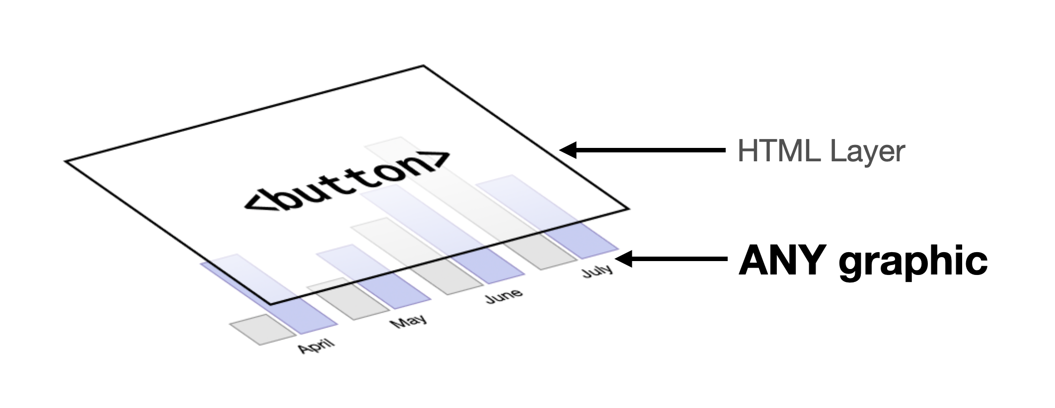
The coolest part about our substrate is twofold: it doesn’t really exist anywhere else and because of that, it has to be added to any existing system where it is used. This gives data visualization libraries and tools a single, simple advantage: they can continue rendering interactive visualizations in whatever way makes sense and leverage Data Navigator as a separate accessibility substrate (in the same way that many screen readers use and construct “accessibility trees” from most interfaces).
The strongest advantage of our system from an implementation perspective is that systems can continue to experiment with and improve rendering speed and visual expressiveness. The accessible interface becomes a modular design space in tandem with this. This means that the design of Data Navigator can make PNGs, canvas-rendered elements, SVGs, video streams, spatial UIs, and 3D contexts accessible without needing to bake this into each of these systems. Data Navigator lets semantic rendering remain a separately composable system from visual rendering.
So our system design is intended like a recipe or pattern, which can be replicated in many different technical environments. Tableau might have different ways of implementing this pattern than Excel, python, R, PowerBI, or JavaScript and HTML. But we hope our system design can become a foundation for a shared space of work and ideation, similar to how visualization grammars carry design concepts across system implementations.
Contribution 2: A working version of our system in JavaScript
Our second major contribution beyond our system design is a technical implementation of it in JavaScript.
I reckon this is the part most folks will be excited about: we built a clean, simple, fast library that can empower data visualizations that end up anywhere online to become more accessible. The library is intended to be integrated into existing web environments where data visualizations are shared, be it visualization libraries like Observable’s Plot or even online data science notebooks and ecosystems, like Jupyter.
We chose to implement our system in JavaScript for the simple reason that we believe it will have the largest impact. While data visualizations may be authored in R, Python, Excel, Tableau, or many other offline environments, the vast majority of data work is shared in online contexts. Data science notebooks, social media, websites, and many email clients, all necessarily use web technology to create an environment for users to share and collaborate.
And thanks to the incredible flexibility and power of web standards and interoperability provided by browser technologies, Data Navigator easily works with a wide variety of different assistive technologies.
Because edges are relationships in our system design, navigation along them can be supported by virtually any input device that can be validated and processed by a web browser.
Many data visualization types (maps especially) have significant research, standards, and guidelines gaps when it comes to accessible navigation. And many people who use assistive technologies other than screen readers are currently entirely unaddressed by data visualization and accessibility research literature.
We want Data Navigator to become a practical tool that sparks a new generation of experimenting with design ideas. What interaction barriers are un- or under-studied? What do people with motor and dexterity disabilities who leverage navigation input technologies want and need from interactive data visualizations? And which chart types pose complex design challenges for navigation technologies? How can we imagine addressing things like dense scatterplots, maps, flow diagrams, network visualizations, and future rendering strategies (3D, AR, VR, and beyond)?
Contribution 3: Demos
Our third and final contribution are our demonstrations of our system design and implementation: we built three case examples!
Our first example shows off how we made a png image of a stacked bar chart navigable. In our live demo you can use keyboard-based input, desktop and mobile screen readers, voice commands, text input commands, and even hand gestures. Of course, this is just a sample of what is possible, but we hope it inspires much more work.
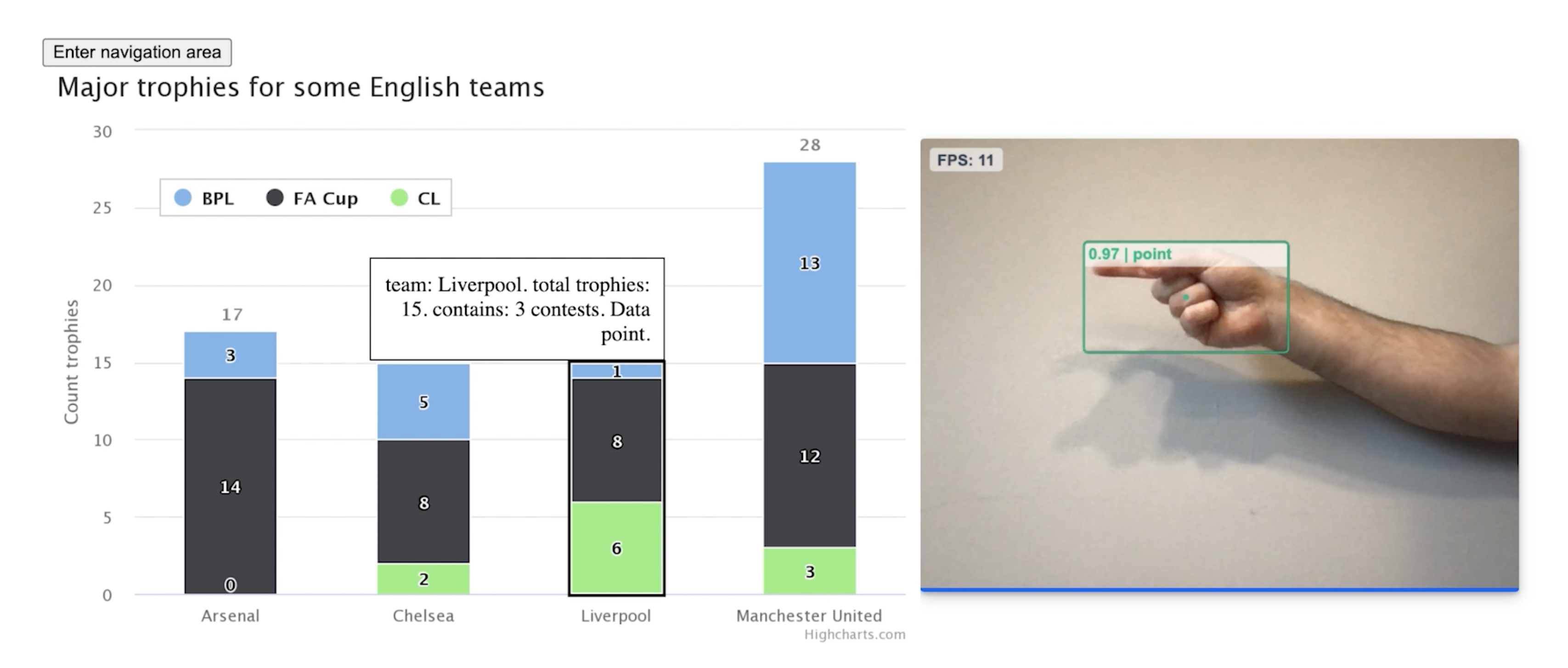
I cannot stress enough: try out the demo to really get a sense of what Data Navigator can do!
Our second case example shows how (with just a small amount of code) Data Navigator can add an accessibility substrate to most data visualizations produced by a charting library. We demo this using vega-lite. If you are someone who builds charting libraries or toolkits, I recommend you check out the code we used and our discussion in the paper.
Our final case example is where we showcase how Data Navigator (as a system) can guide and inspire co-design work that engages novel and unaddressed visualization types. I recommend you check out our paper if you’re a researcher or practitioner who wants to explore new horizons but is intimidated by the idea of co-designing with people with disabilities. We show that this work doesn’t have to be a monumental effort, but can actually be fun.